Bare Truth is a London-based healthy snacking brand built for people who want clean, flavorful, and guilt-free snacks without compromising on taste. The brand’s vision was to create a modern identity that feels energetic, premium, and globally appealing while standing out in the competitive wellness market. Their products are designed for health-conscious consumers who look for better snack alternatives with strong nutritional value and attractive presentation.
For this project, the focus was to develop a packaging design system that instantly grabs attention while clearly communicating the brand’s healthy positioning. The idea was to create packaging that feels bold, fresh, and youthful while maintaining an international premium standard across all product variants.
One of the biggest challenges was creating a visual identity that could stand out in a crowded healthy snack category where most brands follow a minimal and repetitive design style. The packaging needed to look vibrant and eye-catching without losing its premium feel. Another challenge was maintaining consistency across multiple flavors while still giving each variant its own unique personality through color and composition.
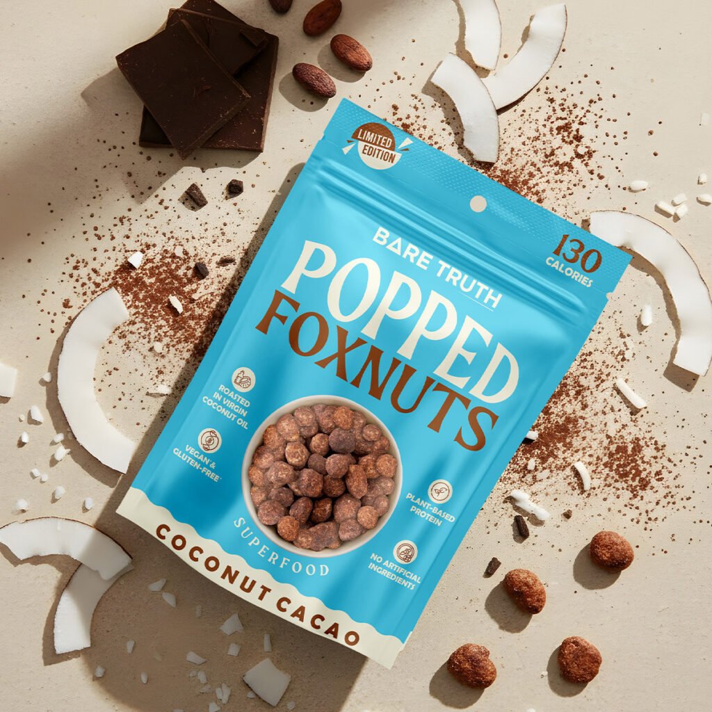
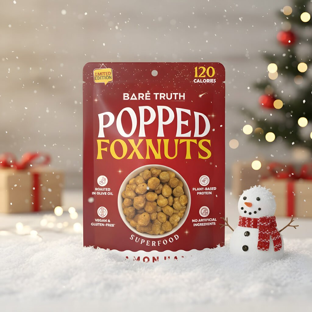
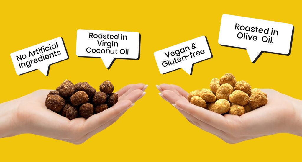
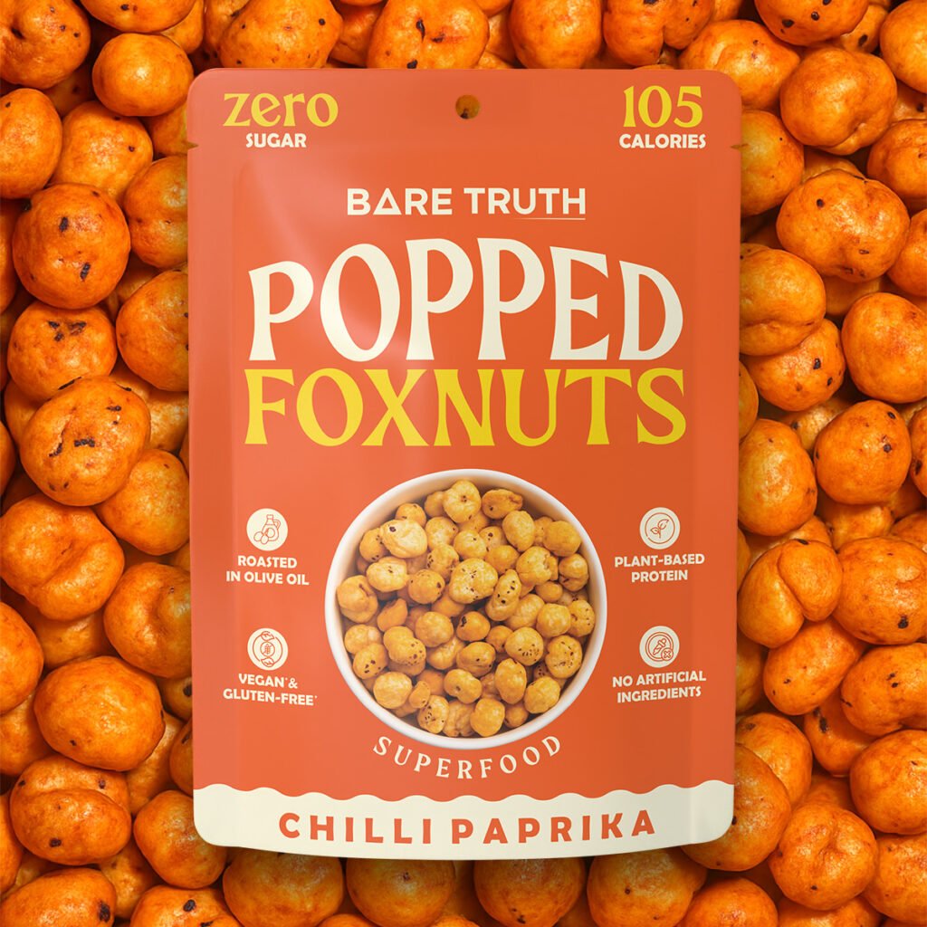
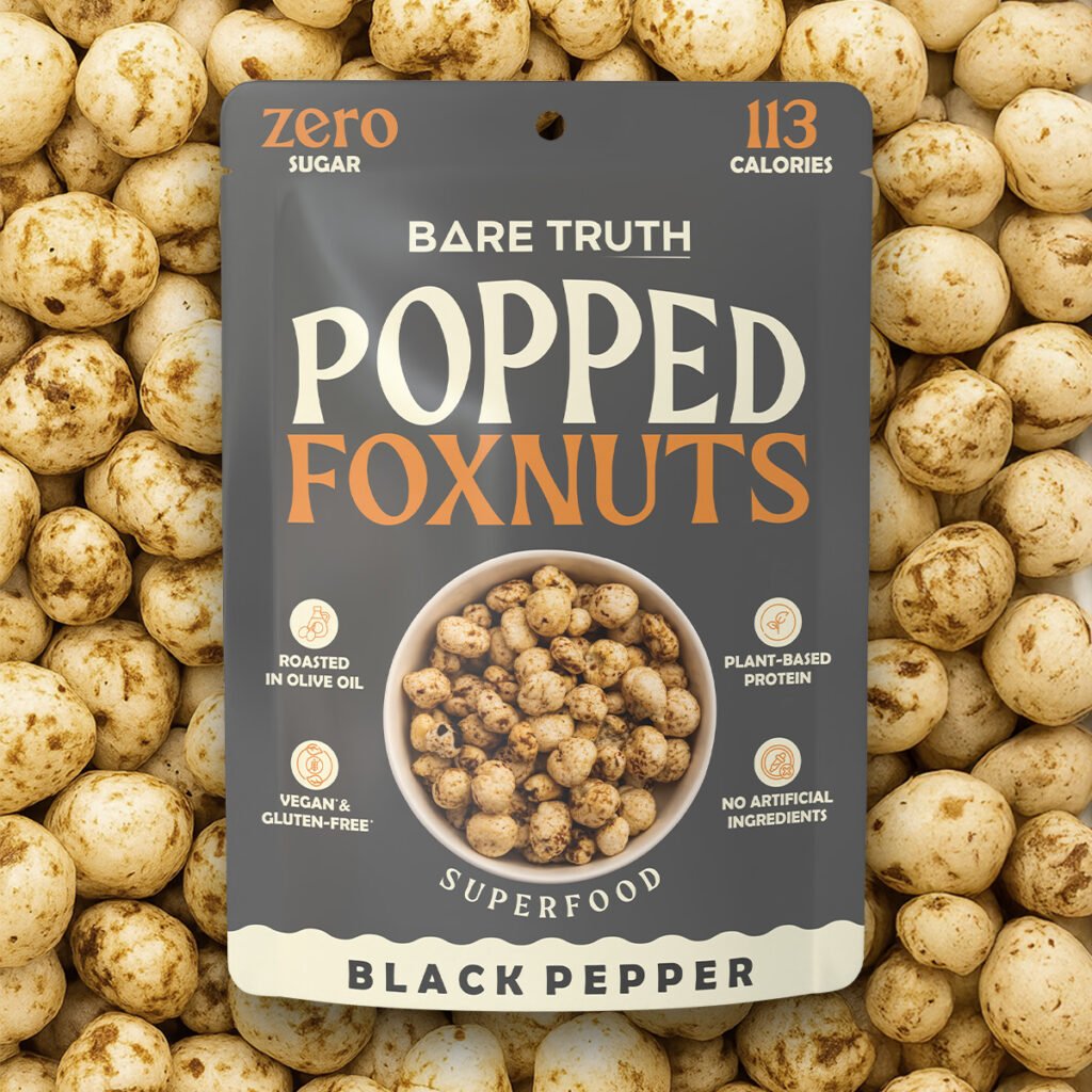
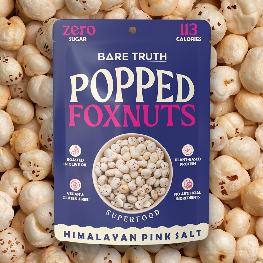
The brand also wanted to highlight important nutritional benefits such as Zero Sugar, Plant-Based Protein, and Low Calories in a clean and organized way. Balancing all these elements without making the design look cluttered required a strong visual hierarchy and thoughtful packaging structure. Additionally, the packaging had to perform well both on retail shelves and online marketplaces where first impressions matter the most.
To solve these challenges, we created a bold and modern packaging system using vibrant color palettes, strong typography, and a clean visual layout that instantly attracts attention. Each flavor was given a distinctive color identity while keeping the overall branding consistent across the entire product range.
The typography was designed to create a strong shelf presence, while the nutritional highlights were placed strategically for quick readability and better consumer engagement. The packaging layout was kept clean and premium to maintain an international look that aligns with the brand’s London-based positioning.
The final outcome successfully transformed the products into a visually striking and market-ready snack range that feels fresh, youthful, and globally competitive while clearly communicating the brand’s healthy lifestyle message.
Branding & packaging
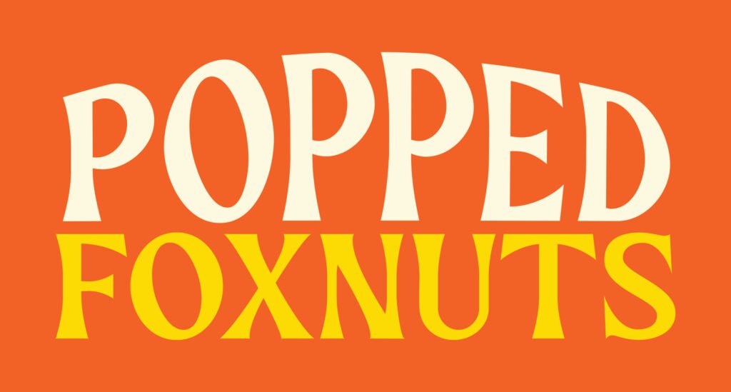
Using Different Colours to Represent Different Food Items
We drew inspiration from the traditional 3D signboards often seen on food carts and trucks across India. This rich visual tradition shaped the creation of a distinctive brand identity and logo. The 3D-looking design of the wordmark logo we crafted reflects this vibrant theme, adding a unique and authentic touch to the brand.