GOLKI was created to deliver the authentic taste of refreshing lemon soda with a modern and premium appeal. Inspired by the vibrant energy of traditional Indian beverages, the brand focuses on offering a naturally refreshing experience that connects with young and modern consumers. The vision behind the brand was to create a strong market presence through packaging that feels energetic, flavorful, and instantly recognizable.
For this project, the main objective was to design a packaging system that captures attention immediately while communicating freshness, taste, and authenticity. The design needed to balance a youthful and vibrant personality with a premium visual appeal that could compete confidently in the beverage market.
Creating a Packaging Design That Stands Out in the Beverage Market
One of the biggest challenges was developing a packaging identity that could stand out in the crowded soft drink category where many brands rely on generic visuals and repetitive layouts. The packaging needed to look refreshing and bold while still maintaining a clean and premium appearance. Another challenge was creating a design that visually communicates the natural lemon flavor and refreshing experience instantly to consumers.
The brand also wanted the packaging to feel energetic and highly engaging without making the composition look cluttered. Maintaining the right balance between typography, product visuals, splash effects, and decorative elements required a strong visual hierarchy and strategic placement of every design component. Additionally, the packaging had to create a strong shelf impact while remaining visually appealing for digital promotions and online platforms.
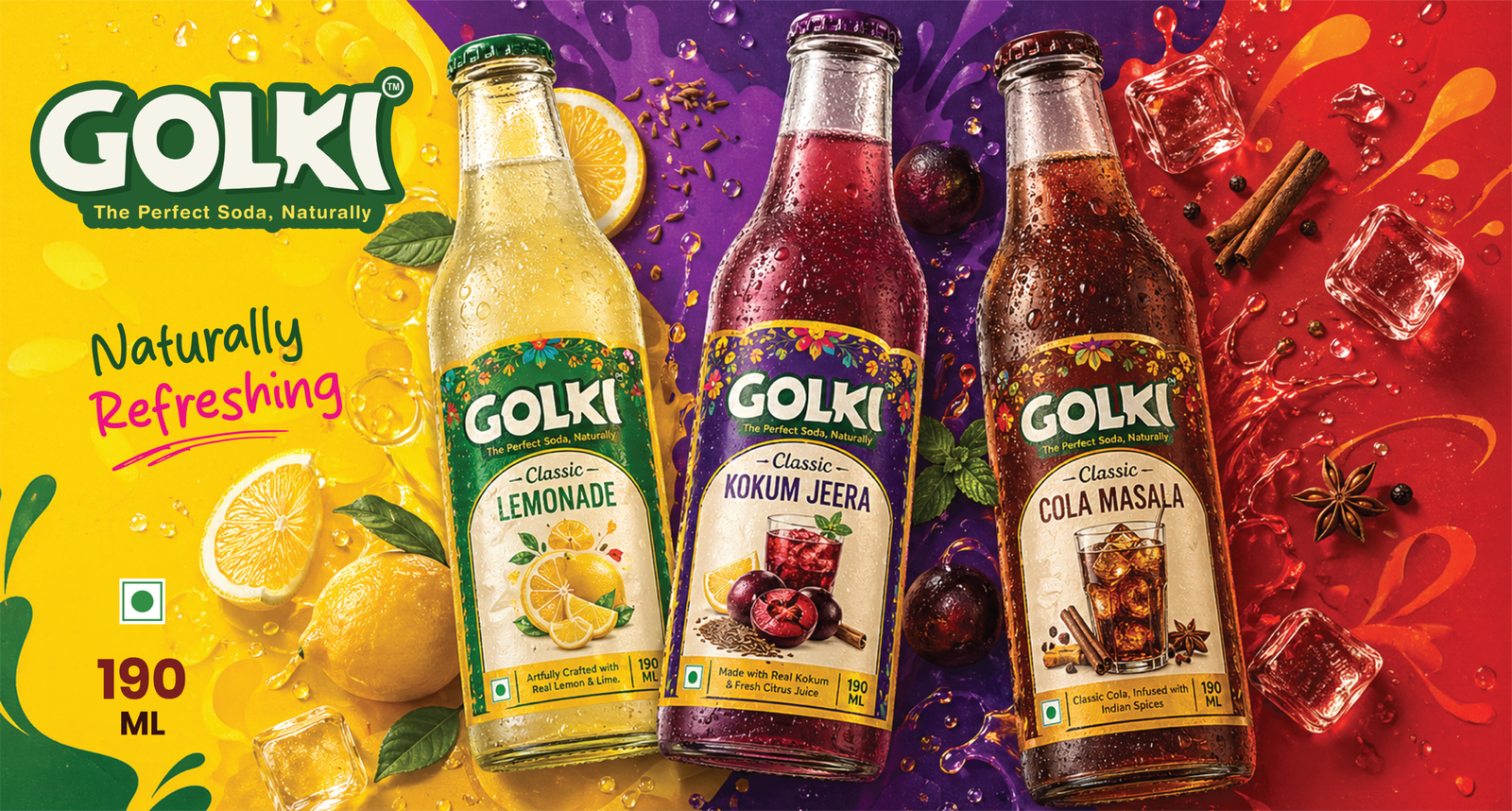
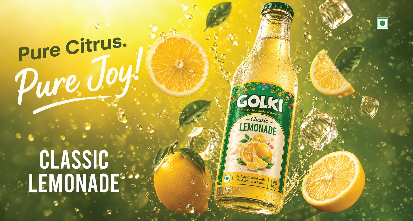
A Bold & Refreshing Packaging System Designed for Maximum Shelf Impact
To solve these challenges, we developed a vibrant and modern packaging design using refreshing green and yellow tones inspired by real lemons and natural freshness. Strong typography, dynamic liquid splash effects, and detailed fruit illustrations were used to create an energetic and visually engaging identity that immediately captures attention.
Each design element was carefully placed to maintain clarity while enhancing the premium feel of the packaging. The bold branding and clean layout helped create a strong shelf presence while ensuring the product messaging remained easy to understand. The final packaging successfully transformed GOLKI into a visually striking and market-ready beverage brand that feels fresh, youthful, and highly competitive in the modern soft drink industry.
The brand promotes confidence without heavy layers, encouraging women to embrace self-love, growth and their unfiltered selves every day.
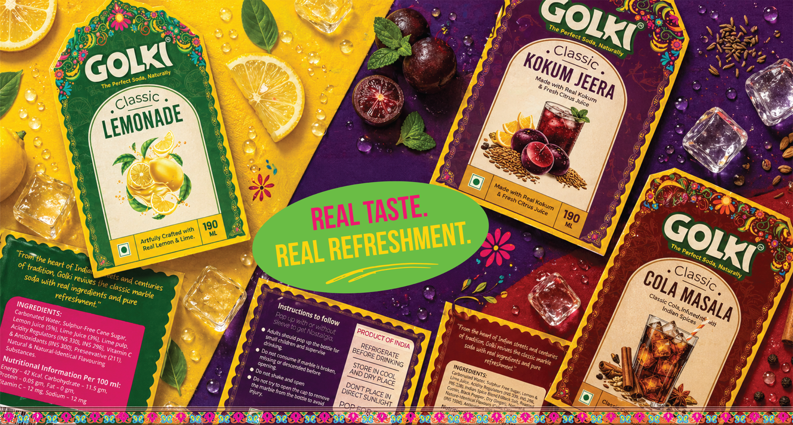
Using Different Colours to Represent Different Food Items
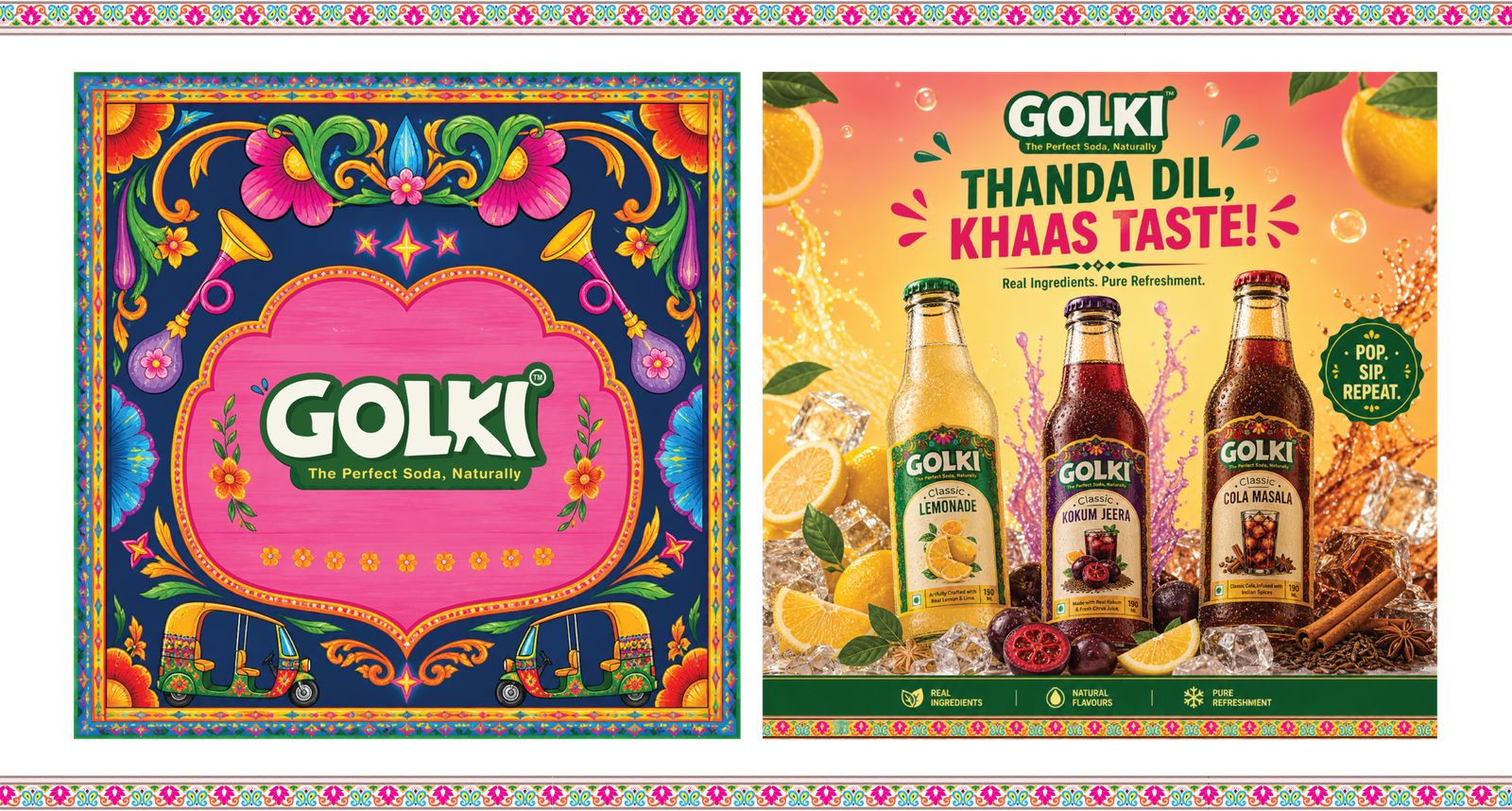
We drew inspiration from the traditional 3D signboards often seen on food carts and trucks across India. This rich visual tradition shaped the creation of a distinctive brand identity and logo. The 3D-looking design of the wordmark logo we crafted reflects this vibrant theme, adding a unique and authentic touch to the brand.